This article is dedicated to analyzing and fixing the issues found with Availity.com’s mobile homepage. Each section of the homepage will be reviewed individually. I will go over its flaws and provide changes that I feel will benefit them. The purpose of this project was not to downplay the skill of any developers involved with its creation. It was solely done to provide educational content and test my web design skills.
I will soon release an article for the desktop view of Availity.com as well. I hope you find this article educational and enlightening.
Click here for a complete overview of both the live website and my local edited copy.
The Navagation Bar
At first glance the navigation bar doesn’t seem too rough. The logo is placed nicely in the top left corner and across the page is a search function and hamburger menu toggle. Underneath is a centered Login button as well as a call to action to register if you are not using the service yet.
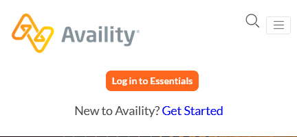
The first issue I noticed is the misalignment of the top right elements (Search and Hamburger Nav). These should be aligned vertically with the logo on the left. The “Login” and register function, while fine, ideally live inside the mobile menu. On Desktop, they should always be visible until a certain breakpoint.
Clicking the search icon uncovers another glaring flaw.
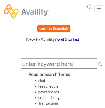
The search field is too big compared to the rest of the nav elements. The search icon next to it isn’t exactly centered vertically, and there is minimal padding between the search box and the “Popular Search Terms”, which aren’t even dynamically rendered, but static text.
Hitting the nav button shows yet another flaw – arguably worse than the previous.
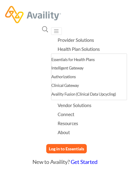
The navigation items show but they are not properly aligned. The search icon is misplaced next to them as if its being flexed in a row, and worst of all, the nav button moved too.
Things get even more hairy when hovering over the menu selections. The sub menus are extremely difficult to use, and would not even work like this on a mobile device, since they are hover effect, not touch. Depending on which menu item you hover over, the menu gets even more wonky.
Navagation Bar Fix
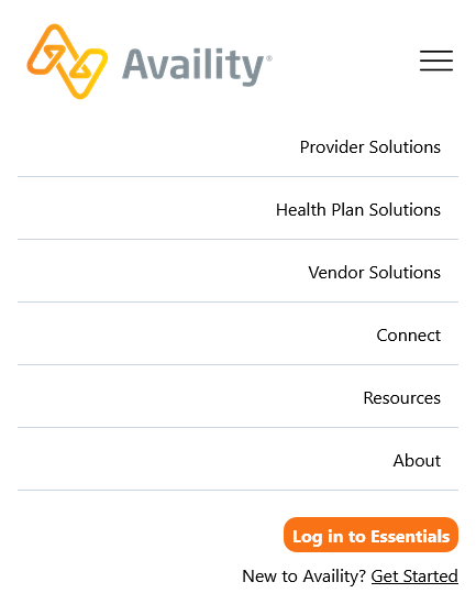
In my fix I address the issue of the misalignment of the nav elements.The menu now has a proper toggle-able hamburger navigation. Padding, margin and dividers were added as necessary. The login and register functions were moved into the navigation (for mobile only) and the company logo was made a teensy bit larger. (For purposes of this demo I did not include the search function) For the sub-categories, they could be handled two ways – an additional drop down section for each nav item or links on each individual page in the menu.
The Hero
The hero’s slideshow needs a few adjustments. It functions properly on both desktop and mobile, however the mobile version has a serious flaw. The content is way too small.

Hero Fix
This is a simple fix. We make content larger. I’ve also decided to make the total height of the hero half the size. On mobile there isn’t any need for the extra wasted space. For the sake of my demo I did not implement a slideshow function, but the same idea applies to each slide. I also kept the same image to showcase its issue. The orange text does not play nice with the orange lines in the design.

Connecting the Network of Healthcare
This section is fine. (Ignore the blue circle, its for accessibility)

Connecting the Network of Healthcare Fix
In my version removed the rounded edges of the image because I didn’t feel that it fit with the rest of the page. I moved a blurb about the company from the bottom of the live page to this section as well.

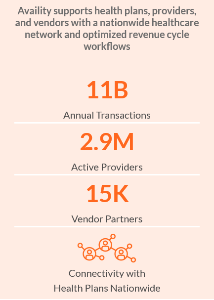
Stats
This section is pretty good. In my opinion the white borders dividing the statistics are pointless though (they are barely visible). Other than that, the light orange area needs a bit more padding.
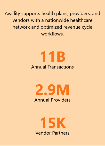
Stats Fix
In my version I did just that, but also changed the background color. I think the original color suits it better. What do you think?
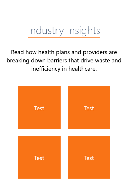
Industry Insights
First thing I noticed about this section was the title. It’s completely different from the previous section’s. It’s much smaller, is the same size as the text content, bold, and is accompanied by a colored underline offset by some pixels. The other aspect that stood out were the rounded squares linking to blogs. On the live page these aren’t actually images with a text overlay and a clickable button. They’re actually images. To save loading time this could be handled differently, but I opted to add placeholder boxes on my remake.

Industry Insights Fix
In my fixed version I changed the title to match the previous section, however I kept the underline.
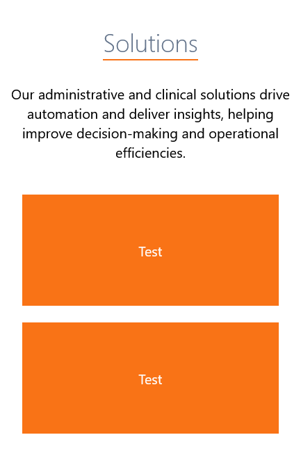
Solutions
I made the exact same fixes for this section, this time going with two rectangles instead of two images as shown in the original.

Solutions Fix
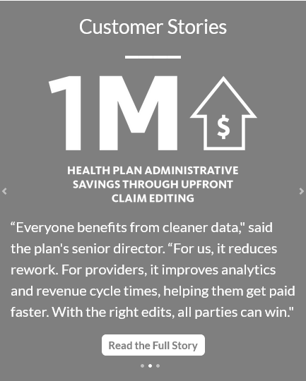
Customer Stories
This section uses another slideshow that changes the total height of the page due to each slide having a different amount of text. Again I opted to not code the slideshow, but instead work on the design of the page.
This section’s issue starts with the header. Unlike the other two, before it that uses an underline with offset, this one is much larger. The images shown are suitable, but they really should be the same size. The caption should also have a maximum character limit to keep the page from changing its height every time the slide changes.
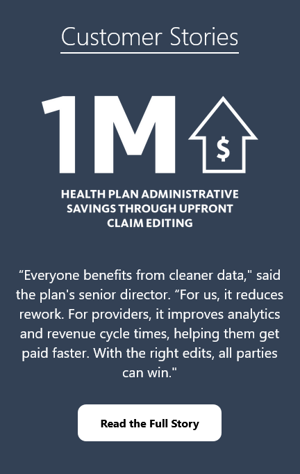
The “Read the Full Story” button is okay. It needs a bit more padding and a better hover color scheme in my opinion. In my design i opted to change its normal text color so it would stand out. I also used a slightly different gray background. I like the way it came out.
Customer Stories Fix
In my fix I made the background darker to better distinguish it from the footer section (next).
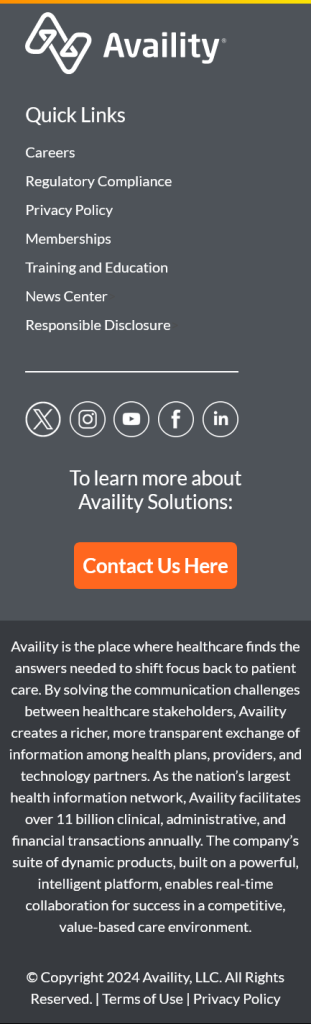
Footer
The original footer contains a logo, a navagation menu, some social media icon links and a contact us button. It also houses a blurb about the company, a copyright notice, and two links to the privacy policy and terms of use.
Footer Fix
First thing I noticed was that the logo is actually two separate entities. Unlike the company logo in the header, the symbol is an image, and the text is HTML. The Quick Links header is fine, but the links could use an adjustment. The same can be said about the contact us section. For some reason the text is centered instead of being aligned to the left like the rest. The font size is also as large as the “Quick Links” header above. As for the button itself, its overall way too big.
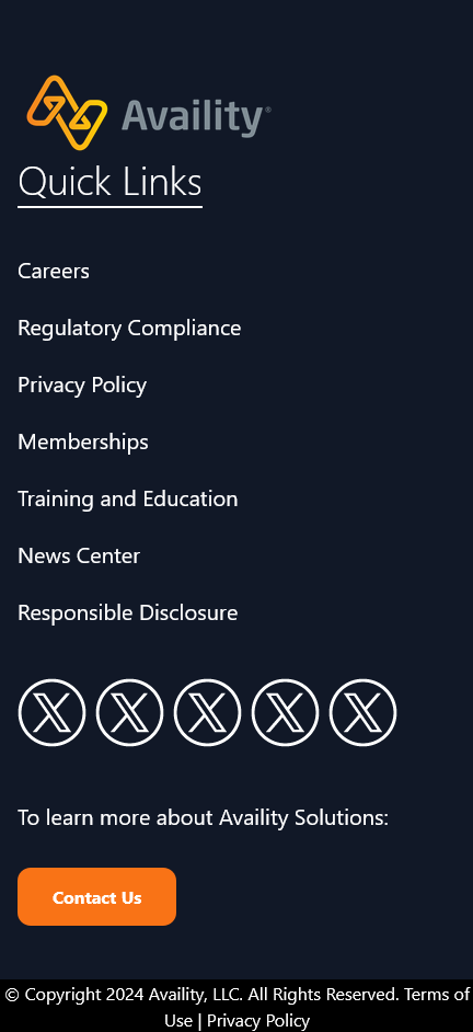
In my design I replaced the company logo and text with the same logo from the header. I also chose to change the footer color to dark blue/ dark slate. The original color was too close to the section before it. I think this color compliments the logo quite well!
I added an underline to distinguish the “Quick Links” header from the rest of the content beneath it. In my design I also decreased the size of the navigation links slightly to help as well. I removed the line separator underneath the links because I felt it was unnecessary, and added the social media icons in the same style, just with less padding between each. (I only bothered to us the Twitter/X icon here).
As for the contact section beneath it, I aligned everything to the left to put it more in line with the rest of the footer and made the button much smaller. I also changed its color (slightly) to match the other buttons on the page. Beneath everything is the copyright notice. I separated it by giving it a black background to make it stand out. The text is smaller than before, and a line break was added where necessary.
Comparison
Availity.com

My Edited Version

Conclusion
This is by no means a finished product. There are still many changes that can be made to my design to improve it further. The point of this project was to put Tailwind to some use and correct mistakes that I see so others can learn as well. This was a great learning experience for me and I hope to redesign more websites in the future.
If you have any questions about my services, feel free to reach out.